How To Start Exploring Level Design As A Concept Artist
Alright, let’s talk about creating a piece of level design concept art!
Something that I’ve always tried to do in my work is to dive straight in and learn from doing rather than holding off until I’m good enough or when I know enough about a specific way of working or career path. I’ve always tried to ‘act as if’ rather than wait and I think everyone should at least give this mindset a go if they want to pursue something. What I mean by that is that when I wanted to create my own clothing brand I acted as if I was already running a clothing brand, when I wanted to become a concept artist, I acted as if I was already creating concept art for games. To be clear though, this wasn’t in a sense of ‘anyone can do this, I’m ready’ it was more of ‘I’ll only get better by doing’.
If there’s a career path, hobby or skill set you want to pursue then just start, even if it’s starting small. You don’t need to wait for someone to tell you that you’re good enough or that you’re ready. I can tell you from my own experience you’ll only waste your own time by waiting! Something I began doing last year was exploring how concept artists use white boxes or block outs created by level designers to work on top of. I didn’t currently work as a concept artist at the time (but I did teach concept art at the time and now work as a concept artist full time on AAA games), however, I knew that this would be a valuable skill to learn if I wanted to pursue a career as a concept artist. So here are some tips!
Make a plan! Why are you doing this?
Like with anything, whether it’s a project, a study or even a tutorial, you need to know why you’re doing something and have a plan of action for it. I originally set out to concept over a blockout with level design in mind because I know it’s a fairly common task within the games industry for a concept artist to carry out. I’d never done it before and I wasn’t being asked to do it for a project, but that didn’t matter. I knew that there was a lot to consider when concepting over a block out and it was much more than the art itself, it would be important to consider things like player pathing, creating interesting gameplay ideas and visual storytelling within the level. My reasoning for doing this was to learn more and to showcase that I could do the tasks that are required in industry, I wasn’t waiting for someone to give me that task, I created it myself.
Don’t fall into the trap of doing something because you’ve seen someone else doing it or you think it’s trendy, make sure it either aligns to your goals or it’s going to be something you’ll just have a lot of fun doing!
Research & use industry techniques
This may seem like an obvious one but it’s super important if you want to get into the industry; make sure you’re using workflows that you would be on the job. This itself will widely differ, especially in terms of what you’re provided with to work on top of, it could literally be some 3D boxes or a screenshot of a well developed level. Try to explore a variety of processes and even better, try to do some digging to see what processes the studios you’re aiming for use!
It’s also important to understand what you’re trying to achieve with each concept. For example, if you’re painting on top of a white box that doesn’t have much information there, you have a lot more creative freedom and ability to really develop the visual of a level. However, if you’re painting over a screenshot of something that’s already been mocked up using existing assets, not always, but often you will find you’re adding flourishes and shouldn’t be changing the overall design too much.
I also did a couple of tutorials by Trent Kanuiga rather than just going in absolutely blind to at least have a basic understanding of the process. I’d always advise learning first and then applying what you’ve learned to your own idea. You can find the tutorials I followed here and here.
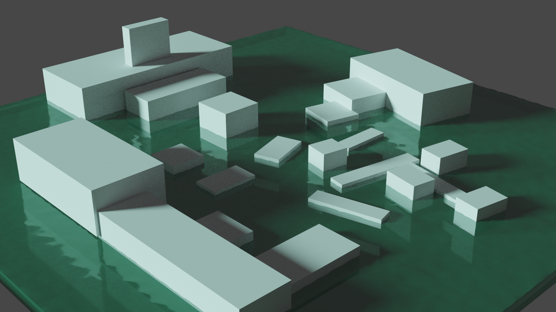
The approach I chose to go with was just working over white boxes, just giving myself enough lighting information to work with. However it didn’t all go to plan initially and I’ll explain why with photos…
This was my first block out and I knew I wanted it to be a puzzle room/shrine room with a big shark statue. You would have different puzzles to figure out in order to traverse across the platforms and it would be quite pirate heavy thematically. I’m going to share some initial ideas with you below, the kind of work I don’t really show at all because it’s super early, messy and just me trying to figure out what could go where. These were my first three sketches and doing a number of sketches is the best approach, especially for concept art when you’re trying to problem solve.
Looking back on these I can see how I could’ve created something really awesome and in all honesty it’s making me want to go back and tackle it again, but my biggest problem at the time was that I wasn’t clear on my idea. I’ve come to realise that I have a really bad habit of coming up with something I want to work on, learning how to do it, making a quick plan and then diving in head first to give it a go. However, I tend to miss out on key parts of the process like the narrative of the idea, the goal of the piece of work itself and collecting reference. I’m much better at this now because I’ve learned from my mistakes, but I know whenever I fall into this trap my whole process and ability to actually nail an idea will fall apart. This is exactly what happened here along with the block out itself being too big. So rather than just continuing to try and make it work, I reset a little, revistied the plan and scaled down the block out to match what I wanted to achieve with this project.
Below is the final block out which is much smaller, but also takes much more into consideration and gives me something a little more informative to work on top of. I appreciate I did mention sometimes you will just be given boxes to work on top of like in my previous block out, but if you’re teaching yourself something, it’s okay to work towards that rather than starting with it.
Consider the player movement and their goals
This may seem like it’s not important for a concept artist to think about because all of this will likely have been sorted by the designers/level designers already. Whilst you will have some limitations in terms of what you can do on top of a white box, it’s up to you to offer some new interesting options too, especially in terms of lighting, player pathways and visual indicators. I do want to be clear though that you shouldn’t just go in and totally revamp how the level works, stick to the limits, but know where you can bend them a little too and get creative with it.
There are many places where you might need to add visual indicators for players from showing which walls can be climbed or using lighting to hint at the path the player should follow. You also need to make sure you don’t block certain things for the player, for example it’s not ideal to hang cloth from the ceiling in certain places incase it blocks the camera (depending on the camera angle of the game) and you don’t want to darken areas too much if a player is supposed to look around those areas. I think this is something I could’ve definitely put better focus on within my level, it’s quite simple overall and there was space to introduce some of those informative visual indicators.
Tell a story within the environment
It’s important that worlds we experience as a player feel believable and a lot of this can be done with visual storytelling that the player might not even notice. It’s similar to how you might not notice an epic piece of music begin during a fight scene or the colour of the lighting slightly change when you enter a new location but you definitely feel it. I was watching a Feng Zhu talk a while back now and something he said that really stuck with me was along the lines of ‘it’s not what you see in a game, it’s what you feel’ and that’s so true about game worlds and their impact on us. It might be as simple as adding claw marks to the wall in a an area leading up to a boss fight with a creature or adding food on a table in a post apocalyptic house where people have had to leave their homes quickly. The story you want to tell is definitely something you should consider in the early stages of planning your level concept.
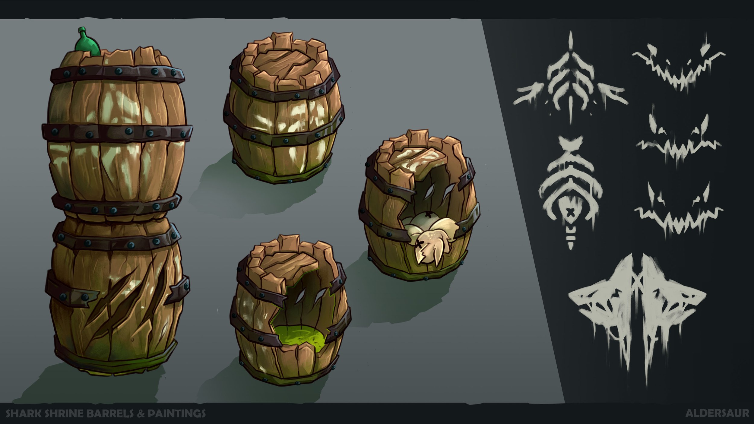
As mentioned earlier, I knew that I wanted my level concept to be some kind of underground puzzle room, but also a room where these sort of bandit creature type characters spent a lot of time worshiping their leader (who is essentially a huge shark). When I was figuring out the environment I was thinking about who would be using it and how they would use it, bandits could have camps, prisoners, weapon stashes or weird rituals, there’s so many different routes but it has to be right for your idea. One thing I did think about was bandit signs and the idea that they’d taken bits from old ships to add to the environment. So if you look around you’ll see barrels, ship wheels, masts and gang signs, all elements that add some story and history. There’s also claw marks on the walls and a skeleton stuck to the wall with a sword in their chest, hinting at previous encounters in this location. Here’s some examples of the storytelling in the call out sheets but you can also see more in the full concept at the end!
Have Awareness throughout the rendering process
One thing that I see a lot of students doing especially when learning about concept art is that they see each process as being very linear and in most cases that’s not how it works. There’s a lot of back and forth, looping back round to the beginning of the process to double check things and taking time to revisit reference where needed when things aren’t quite working. It’s crucial to keep asking yourself all the things mentioned above while working on the concept. Does the lighting still set the right atmosphere? Are the puzzles clear? Is there a narrative within the space?
Don’t just assume because you’ve planned out these elements before started that they will automatically come through in your idea. Always be checking and asking yourself these questions about your work!
When trying to learn something new I always try to lean into my strengths for the most part and make sure only about 20-30% of the project is something new to learn as it’s easy to get really overwhelmed otherwise. For me this meant that sticking to my style and my rendering process along with a topic I use a lot in my work made learning about concepting for level design much easier. I’ll pop all of my images below along with my callout sheets as this was something else I wanted to improve on in order to really show off my concept artist skills as I felt my portfolio was a bit too illustration heavy. I genuinely don’t believe I would’ve got my current job as a full time concept artist without this project in all honesty!
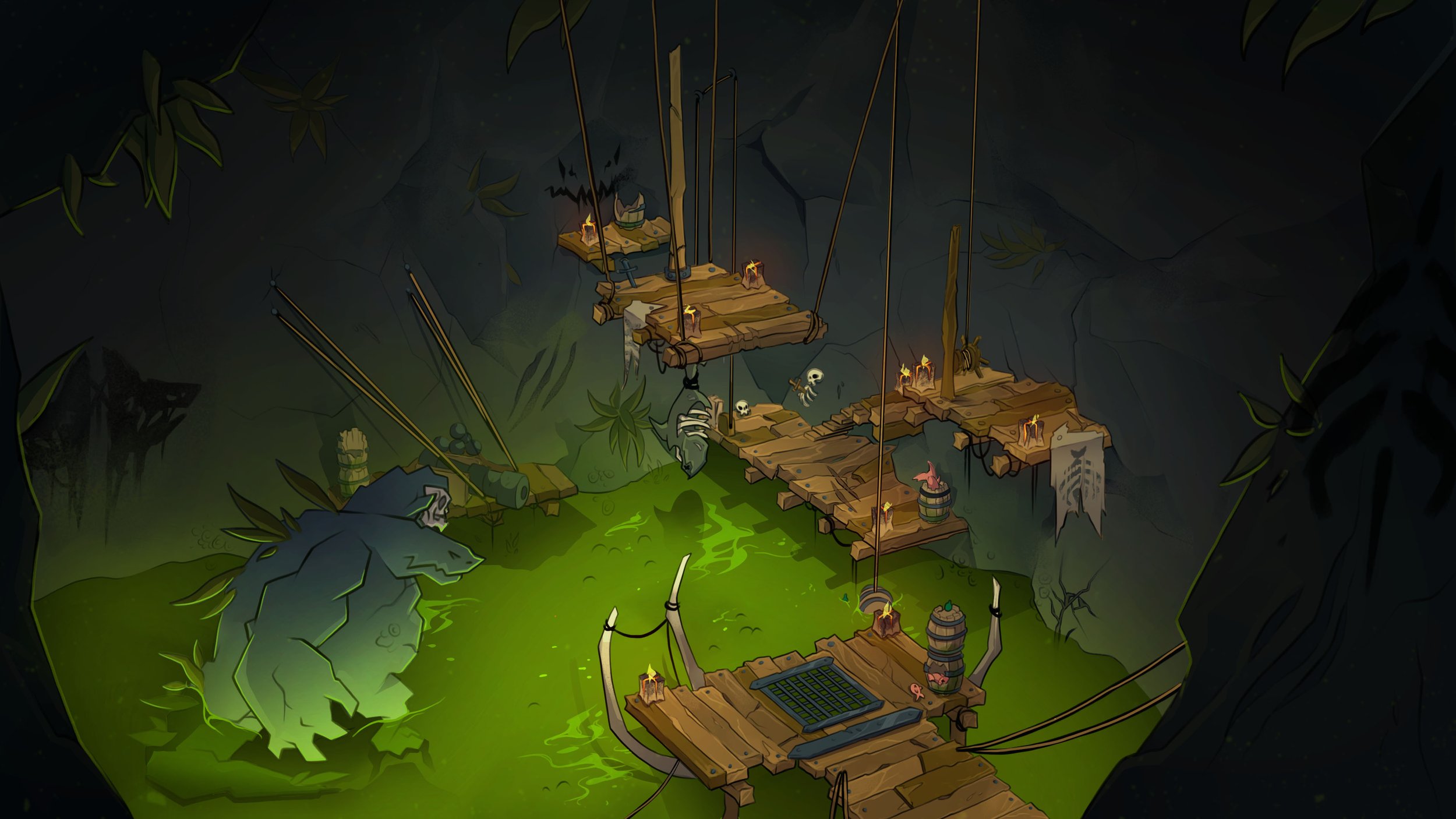

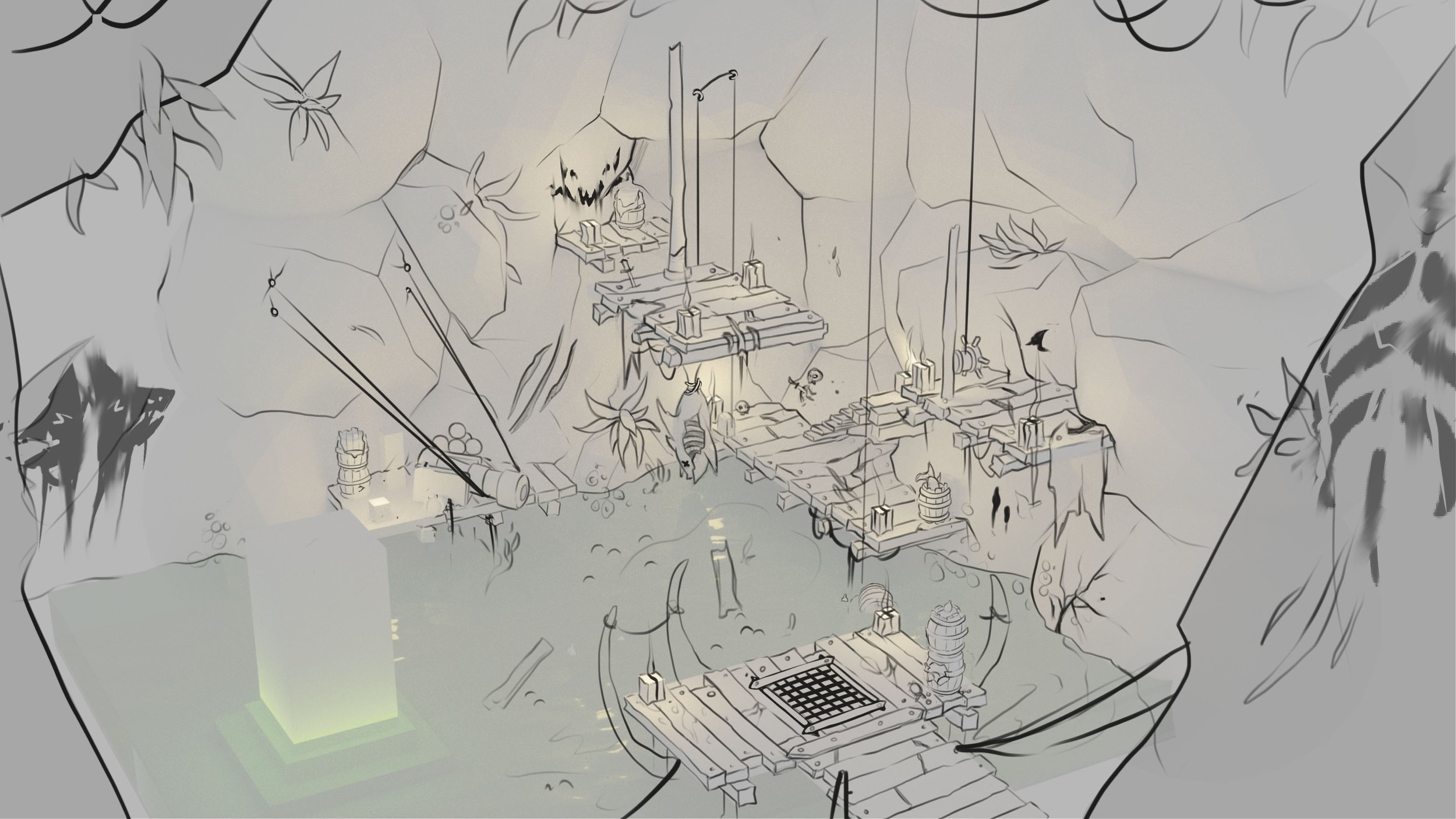
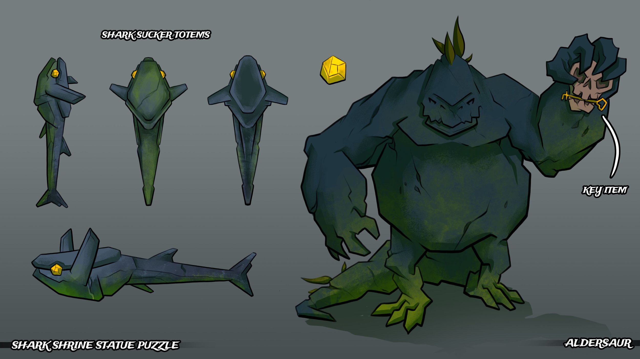
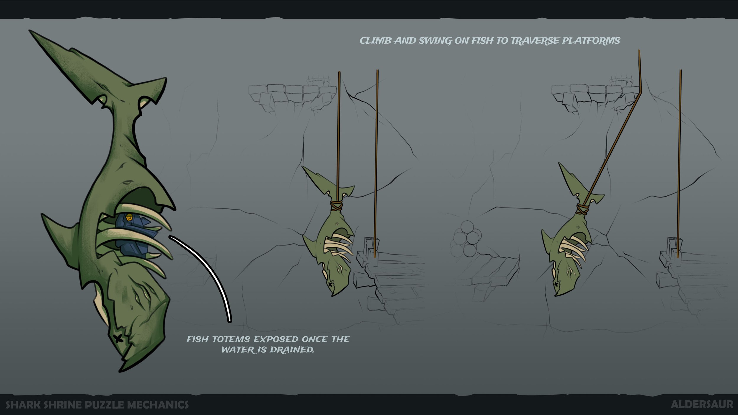
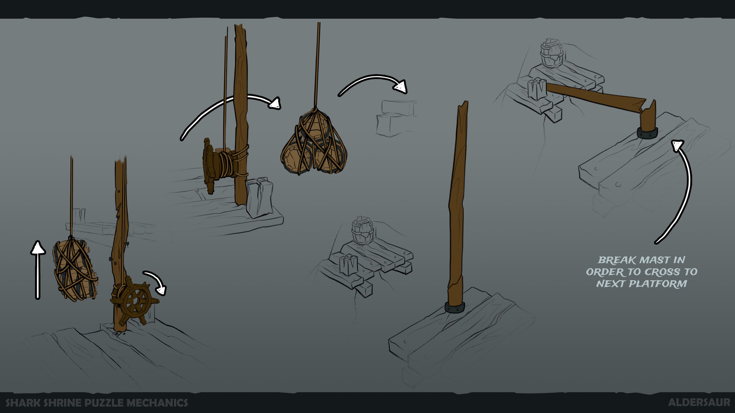
I hope that all makes sense and as always feel free to shoot me any questions if you do have any!
