Alinick & The Spider Queen
I've had a bit of a break since my last blog post, purely for personal reasons, but these kind of breaks are always needed and I definitely feel better for it, hopefully I should be back to a weekly schedule now, although we will have to see how that goes as I have some plans to publish content on other platforms too!
If you've been following my work/blog for a while you will have seen than I have been working with an author (by the name of Brian Day, he's an awesome guy!) on a series of books called 'The Alinick Chronicles'). Well, I recently just finished up book 3 (or pretty much, just the back cover to go!); 'Alinick and the Spider Queen' and thought I would share some of the illustrations that I did for it with you today. Here are the covers from book 1 and 2 just to refresh anyone's memory or give those of you a look who haven't seen them in the past.
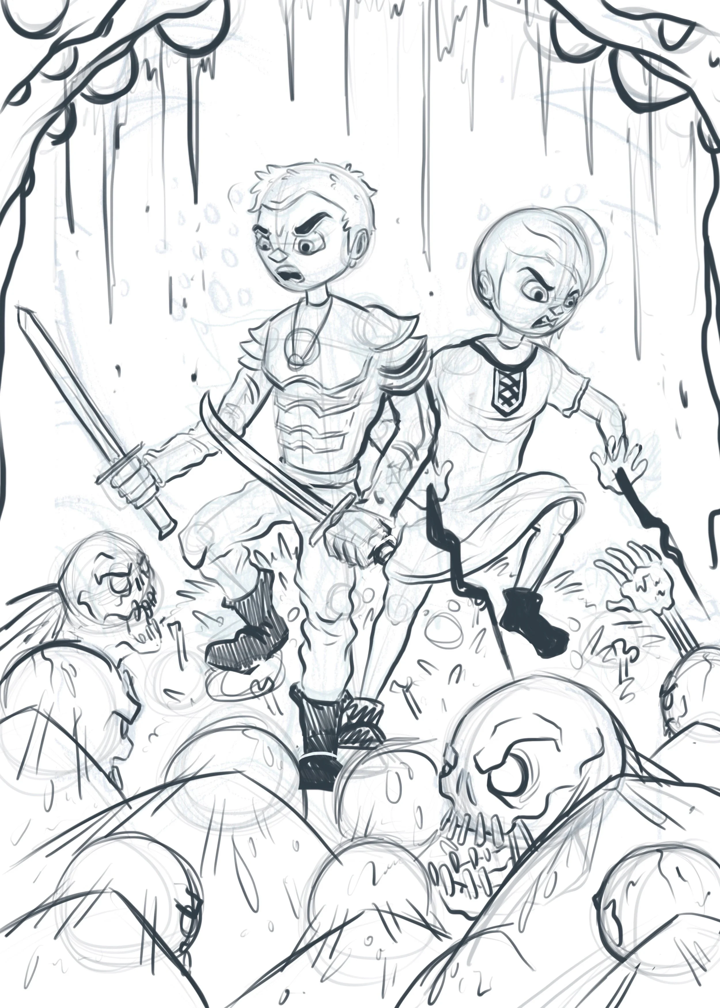
As usual I started out with a couple of sketches based on ideas that I already had in my head. I struggled a little at first with this one purely because there were a lot of elements to fit into one illustration (bearing in mind the books themselves are around A5 size when printed so it's a pretty small illustration) and I didn't want it to look too similar to the first one, I wanted to try something new. So I tried to fit in the majority of the elements included in the story, without giving away the monster at the same time, but hinting at it instead with the eggs up in the corner and the eyes behind them.
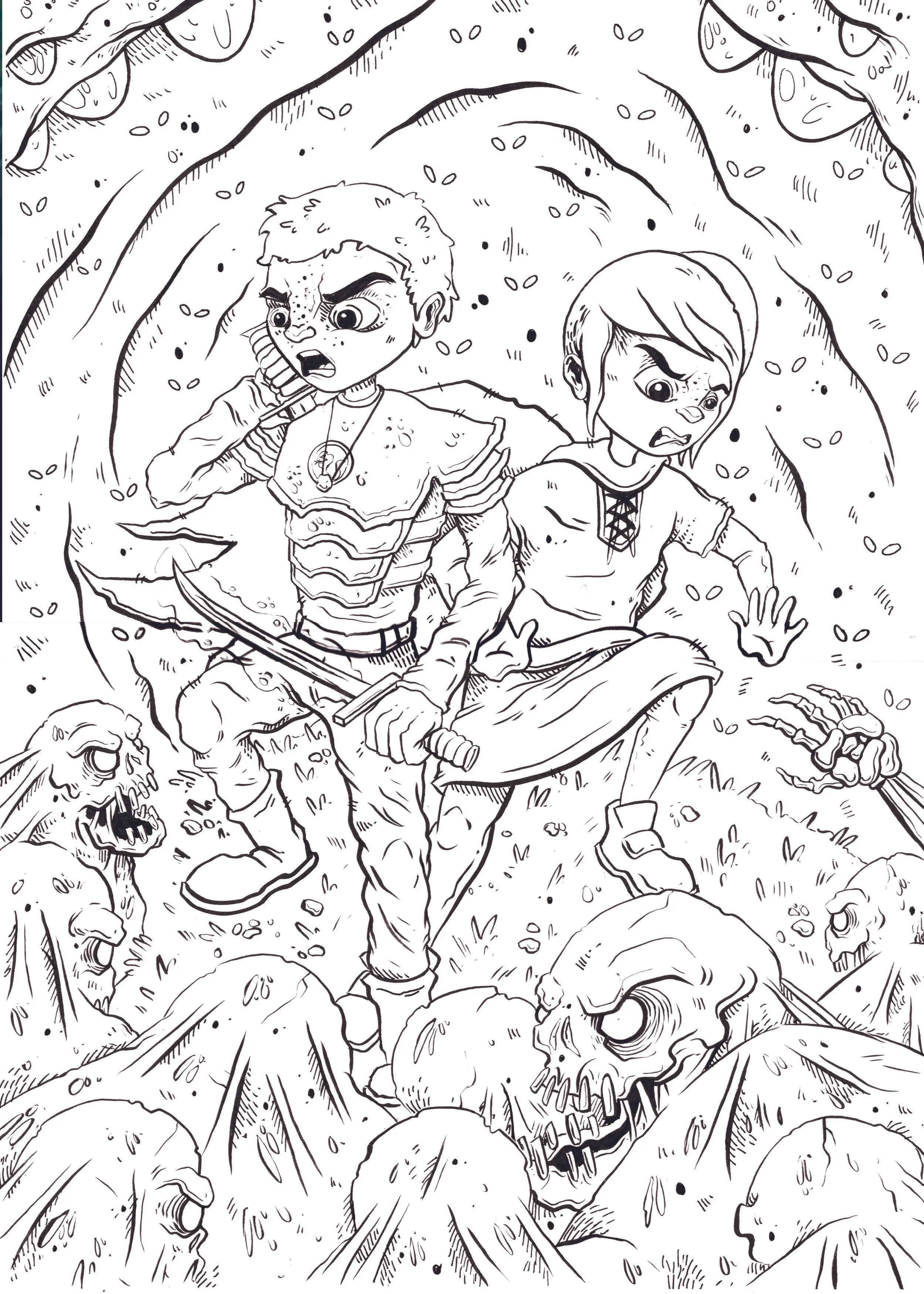
In the initial stages I always keep it pretty rough, so there are a lot of bits that are off but as long as I can get the composition and general idea across then I'm happy. So after that I refined the idea a lot more and made the characters actually look how they should and put in enough detail for me to be able to use when it came to line working the illustration with my brush pen. Here's a look at the finished lines once I've scanned them in and cleaned them up a bit ready for colouring.
I don't usually ink my lines traditionally and instead usually stick to digital only, but sometimes it's a nice change, plus both me and Brian agreed that it really suits these books and the style of the art in them, so it's something I'll be sticking to for this books for sure.
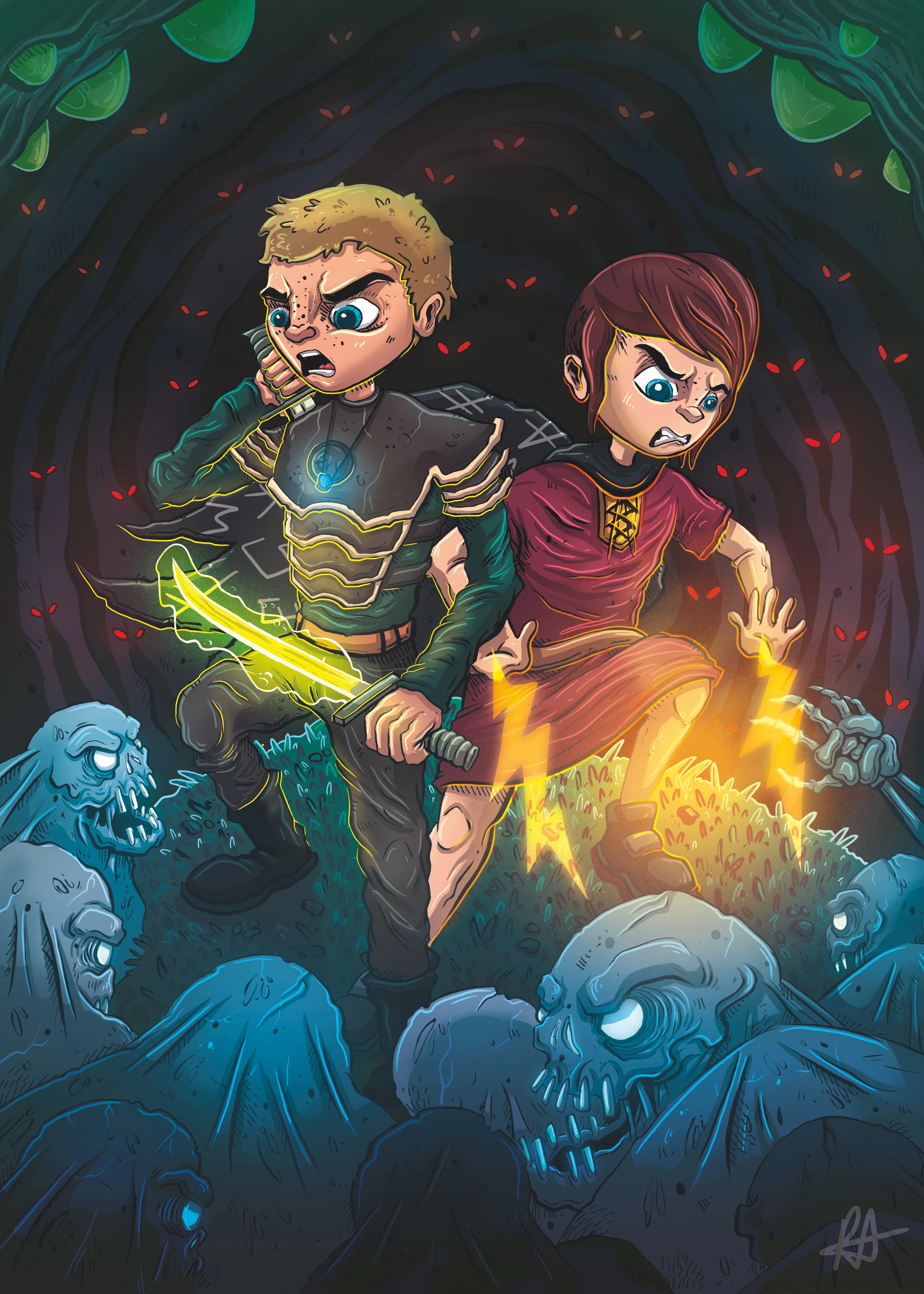
And of course, here is the finished cover, I think it turned out really nice and it's awesome to be able to visually see the progression in my style, my process and the characters themselves.
Here is a sneaky peek at some of my favourite illustrations from inside the book too.
If you'd like to buy any of the books (The Spider Queen will be coming soon), then head on over to Brian's Amazon page and treat yourself!
I've been brainstorming some ideas for new content for the blog, and for my Youtube channel, however my brain hasn't been at it's best lately so if there's something you'd like to know eg. Advice, tutorials, tips, recommendations, reviews etc. please let me know either through a comment on here, through my contact page, or my Twitter and I will be sure to add it to my list!
Thanks for reading guys!


