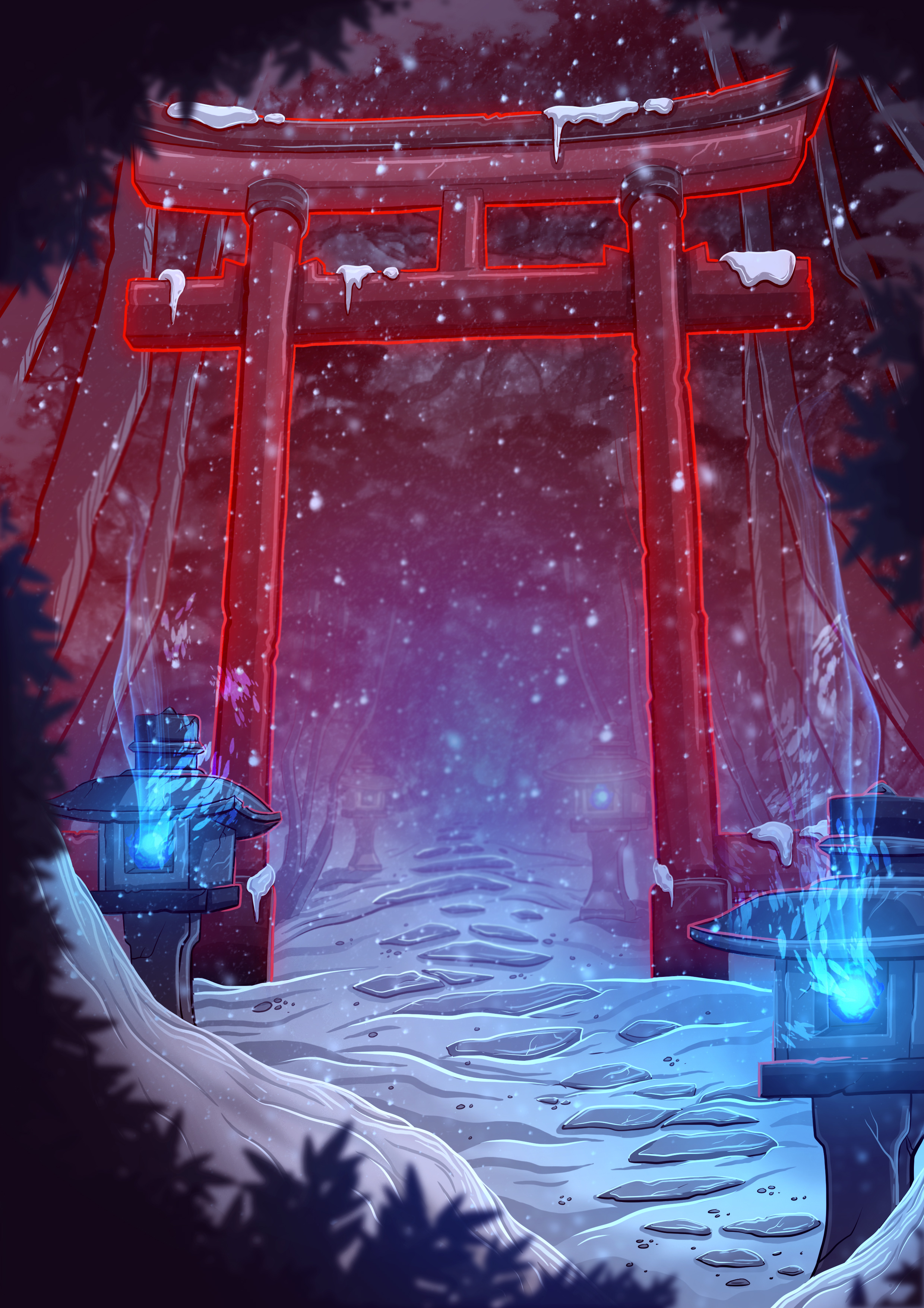
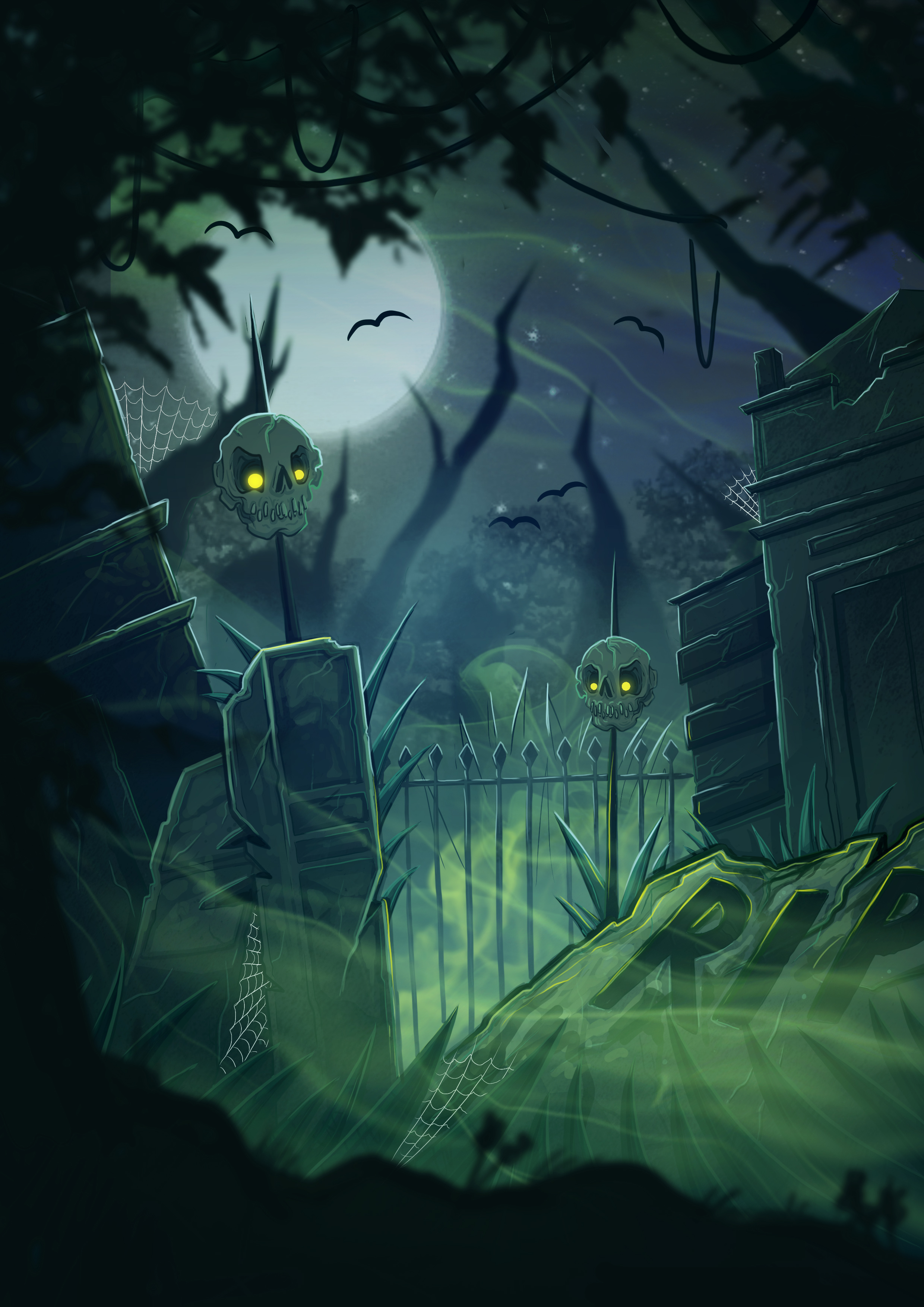
MY FIRST TIME ILLUSTRATING ENVIRONMENTS
I feel like I've gotten to a point in my career (even though it's still very early on!) where I'm hired by clients particularly for my character design skills, even if it's an illustration they're looking for and not a character sheet or even some type of branding, a 'character' is still usually the main focus.
So when I was reading the card listings for Escape from Fusion Earth and saw that it would require 4 environment/location cards, I was slightly worried as I'd never done them before, but also pretty excited because I think it's important in the creative industry to look at a brief/project and think about what you can do with it using your skill set rather than what you've already seen other artists do with the same type of theme.
First of all, I will say that it's easy in a project like this where there's no many illustrations to lose track of some of the designs seeing as I've been working on it for over a year now, but I still make sure that when I'm working on a new card I regularly compare it against the other cards to make sure none of them look too similar or that there isn't too many cards that are a similar colour etc. So I wanted to make sure that each location card looked very different and could easily be identified on a small scale at a glance.


